Randomized controlled trials (RCTs)
There’s no video for this example, since the R code is fairly straightforward, and since I talked about it in the lecture (see the slides).
If you want to follow along with this example, you can download the data below:
library(tidyverse)  # ggplot(), %>%, mutate(), and friends
library(ggdag)  # Make DAGs
library(scales)  # Format numbers with functions like comma(), percent(), and dollar()
library(broom)  # Convert models to data frames
library(patchwork)  # Combine ggplots into single composite plots

set.seed(1234)   # Make all random draws reproducible
village_randomized <- read_csv("data/village_randomized.csv")
Program details
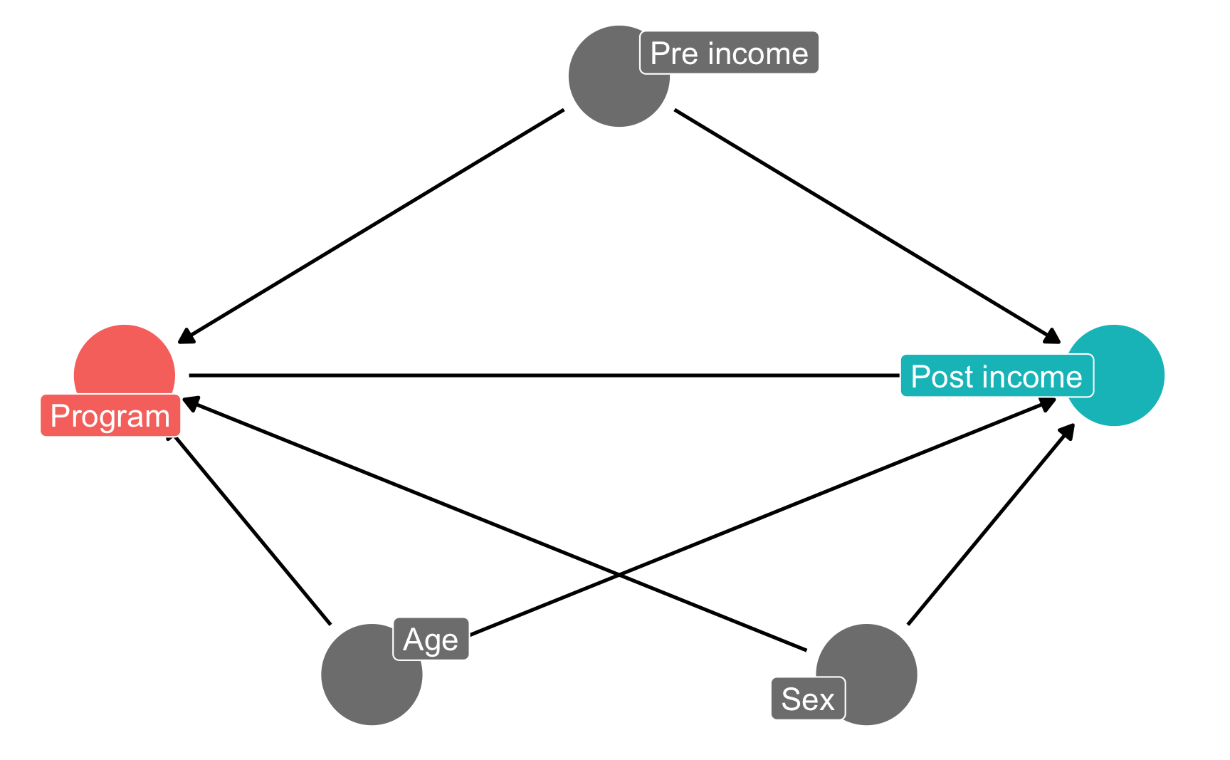
In this hypothetical situation, an NGO is planning on launching a training program designed to boost incomes. Based on their experiences in running pilot programs in other countries, they’ve found that older, richer men tend to self-select into the training program. The NGO’s evaluation consultant (you!) drew this causal model explaining the effect of the program on participant incomes, given the confounding caused by age, sex, and prior income:
income_dag <- dagify(post_income ~ program + age + sex + pre_income,
                     program ~ age + sex + pre_income,
                     exposure = "program",
                     outcome = "post_income",
                     labels = c(post_income = "Post income",
                                program = "Program",
                                age = "Age",
                                sex = "Sex",
                                pre_income = "Pre income"),
                     coords = list(x = c(program = 1, post_income = 5, age = 2,
                                         sex = 4, pre_income = 3),
                                   y = c(program = 2, post_income = 2, age = 1,
                                         sex = 1, pre_income = 3)))

ggdag_status(income_dag, use_labels = "label", text = FALSE, seed = 1234) +
  guides(color = "none") +
  theme_dag()
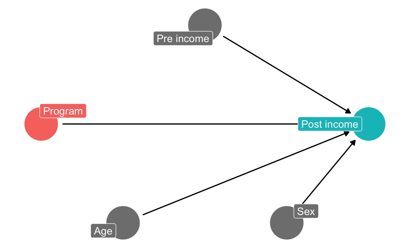
The NGO just received funding to run a randomized controlled trial (RCT) in a village, and you’re excited because you can finally manipulate access to the program—you can calculate \(E(\text{Post-income} | do(\text{Program})\). Following the rules of causal diagrams, you get to delete all the arrows going into the program node:
income_dag_rct <- dagify(post_income ~ program + age + sex + pre_income,
                         exposure = "program",
                         outcome = "post_income",
                         labels = c(post_income = "Post income",
                                    program = "Program",
                                    age = "Age",
                                    sex = "Sex",
                                    pre_income = "Pre income"),
                         coords = list(x = c(program = 1, post_income = 5, age = 2,
                                             sex = 4, pre_income = 3),
                                       y = c(program = 2, post_income = 2, age = 1,
                                             sex = 1, pre_income = 3)))

ggdag_status(income_dag_rct, use_labels = "label", text = FALSE, seed = 1234) +
  guides(color = "none") +
  theme_dag()
1. Check balance
You ran the study on 1,000 participants over the course of 6 months and you just got your data back.
Before calculating the effect of the program, you first check to see how well balanced assignment was, and you find that assignment to the program was pretty much split 50/50, which is good:
village_randomized %>%
  count(program) %>%
  mutate(prop = n / sum(n))
## # A tibble: 2 × 3
##   program        n  prop
##   <chr>      <int> <dbl>
## 1 No program   503 0.503
## 2 Program      497 0.497
You then check to see how well balanced the treatment and control groups were in participants' pre-treatment characteristics:
village_randomized %>%
  group_by(program) %>%
  summarize(prop_male = mean(sex_num),
            avg_age = mean(age),
            avg_pre_income = mean(pre_income))
## # A tibble: 2 × 4
##   program    prop_male avg_age avg_pre_income
##   <chr>          <dbl>   <dbl>          <dbl>
## 1 No program     0.584    34.9           803.
## 2 Program        0.604    34.9           801.
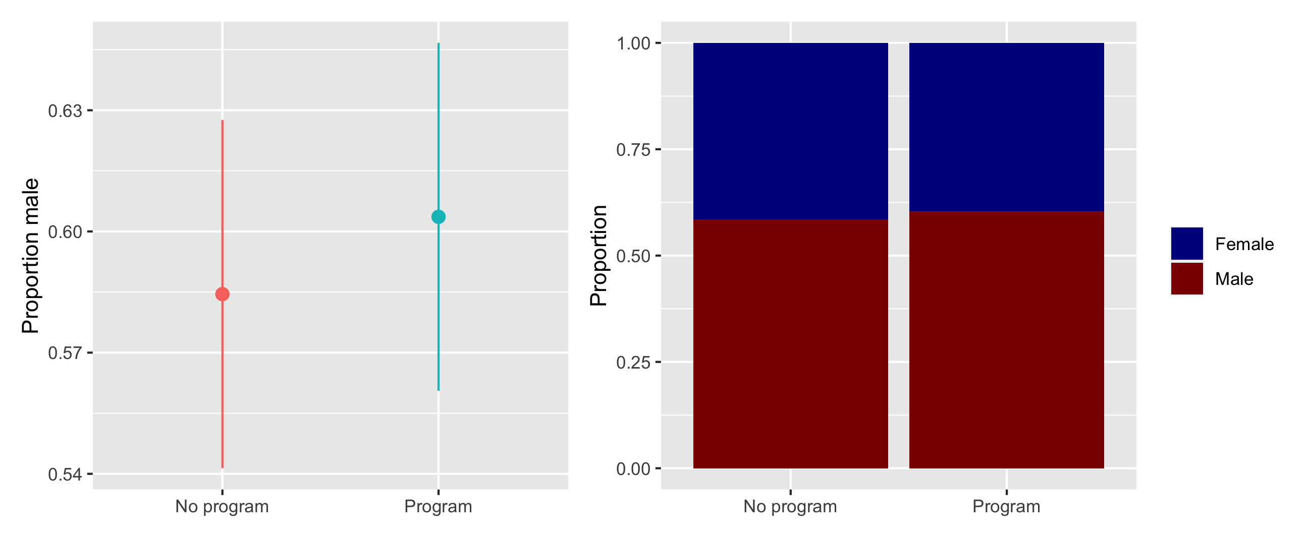
These variables appear fairly well balanced. To check that there aren’t any statistically significant differences between the groups, you make some graphs (you could run t-tests too, but graphs are easier for your non-statistical audience to read later).
There were more men in both the treatment and control groups, but the proportion is the same in both, and there’s no substantial difference in sex proportion:
# Here we save each plot as an object so that we can combine the two plots with
# + (which comes from the patchwork package). If you want to see what an
# individual plot looks like, you can run `plot_diff_sex`, or whatever the plot
# object is named.
#
# stat_summary() here is a little different from the geom_*() layers you've seen
# in the past. stat_summary() takes a function (here mean_se()) and runs it on
# each of the program groups to get the average and standard error. It then
# plots those with geom_pointrange. The fun.args part of this lets us pass an
# argument to mean_se() so that we can multiply the standard error by 1.96,
# giving us the 95% confidence interval.
plot_diff_sex <- ggplot(village_randomized, aes(x = program, y = sex_num, color = program)) +
  stat_summary(geom = "pointrange", fun.data = "mean_se", fun.args = list(mult = 1.96)) +
  guides(color = "none") +
  labs(x = NULL, y = "Proportion male")
# plot_diff_sex  # Uncomment this if you want to see this plot by itself

plot_prop_sex <- ggplot(village_randomized, aes(x = program, fill = sex)) +
  # Using position = "fill" makes the bars range from 0-1 and show the proportion
  geom_bar(position = "fill") +
  labs(x = NULL, y = "Proportion", fill = NULL) +
  scale_fill_manual(values = c("darkblue", "darkred"))

# Show the plots side-by-side
plot_diff_sex + plot_prop_sex
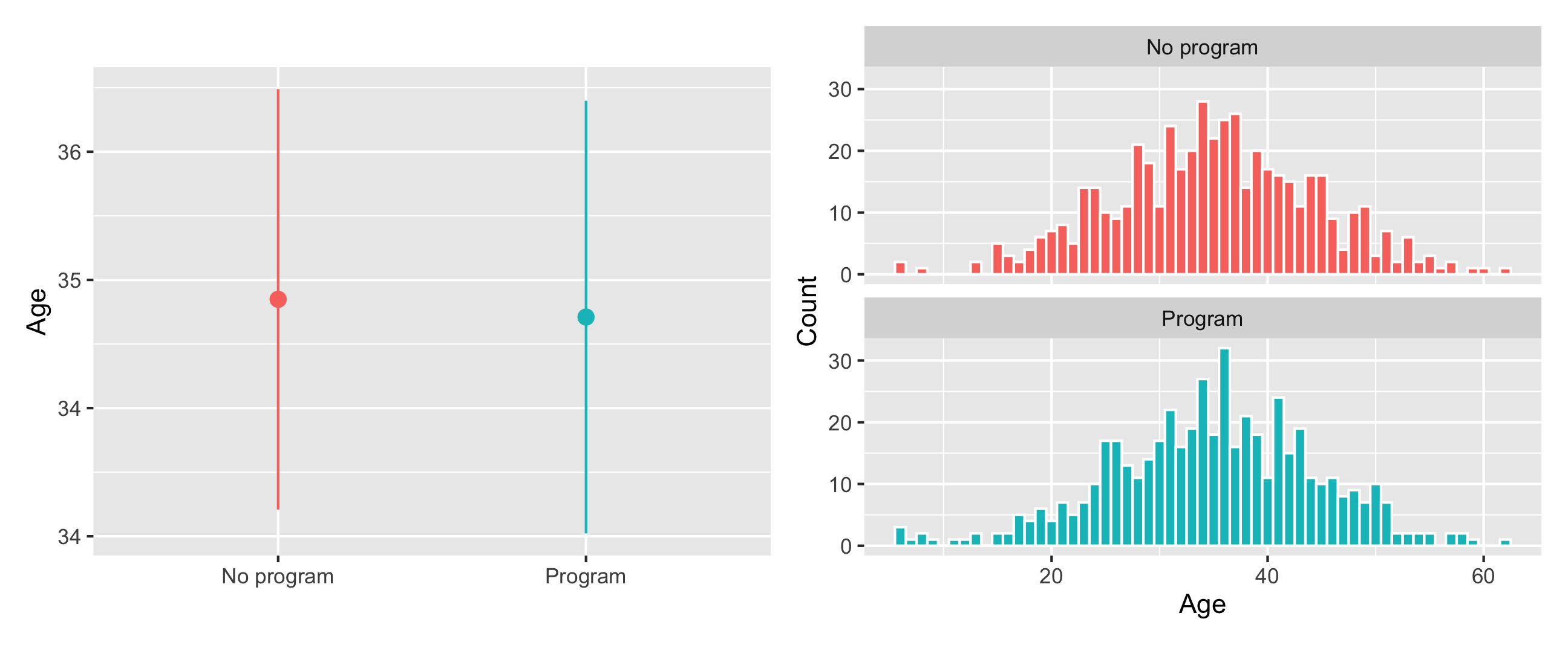
The distribution of ages looks basically the same in the treatment and control groups, and there’s no substantial difference in the average age across groups:
plot_diff_age <- ggplot(village_randomized, aes(x = program, y = age, color = program)) +
  stat_summary(geom = "pointrange", fun.data = "mean_se", fun.args = list(mult = 1.96)) +
  guides(color = "none") +
  labs(x = NULL, y = "Age")

plot_hist_age <- ggplot(village_randomized, aes(x = age, fill = program)) +
  geom_histogram(binwidth = 1, color = "white") +
  guides(fill = "none") +
  labs(x = "Age", y = "Count") +
  facet_wrap(vars(program), ncol = 1)

plot_diff_age + plot_hist_age
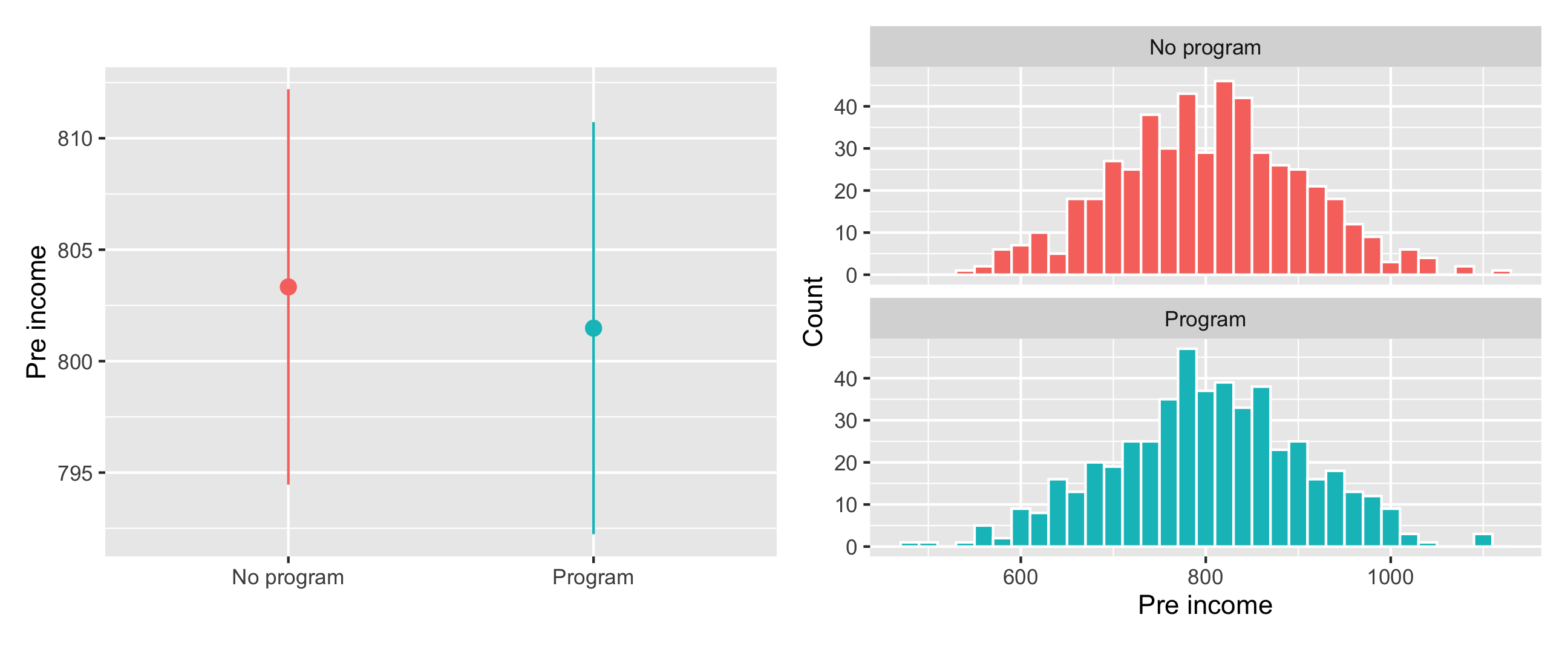
Pre-program income is also distributed the same—and has no substantial difference in averages—across treatment and control groups:
plot_diff_income <- ggplot(village_randomized, aes(x = program, y = pre_income, color = program)) +
  stat_summary(geom = "pointrange", fun.data = "mean_se", fun.args = list(mult = 1.96)) +
  guides(color = "none") +
  labs(x = NULL, y = "Pre income")

plot_hist_income <- ggplot(village_randomized, aes(x = pre_income, fill = program)) +
  geom_histogram(binwidth = 20, color = "white") +
  guides(fill = "none") +
  labs(x = "Pre income", y = "Count") +
  facet_wrap(vars(program), ncol = 1)

plot_diff_income + plot_hist_income
All our pre-treatment covariates look good and balanced! You can now estimate the causal effect of the program.
2. Estimate difference
You are interested in the causal effect of the program, or
$$ E[\text{Post income}\ |\ do(\text{Program})] $$
You can find this causal effect by calculating the average treatment effect:
$$ \text{ATE} = E(\overline{\text{Post income }} | \text{ Program} = 1) - E(\overline{\text{Post income }} | \text{ Program} = 0) $$
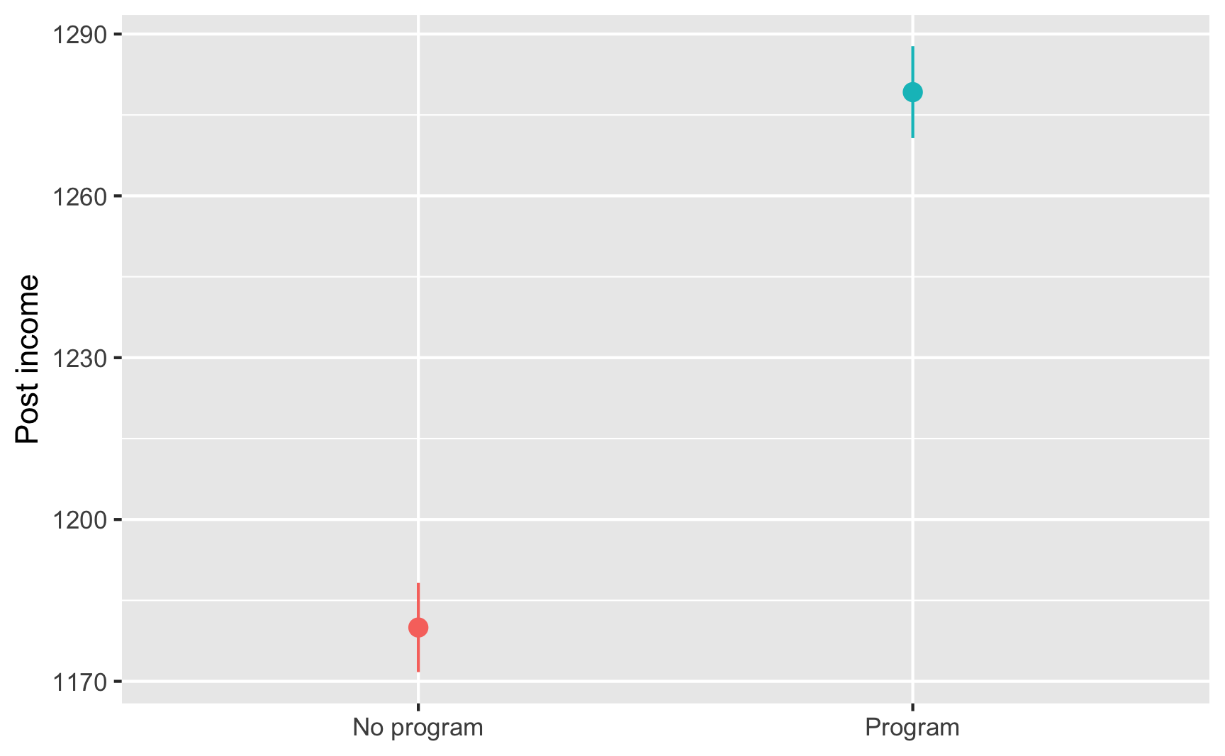
This is simply the average outcome for people in the program minus the average outcome for people not in the program. You calculate the group averages:
village_randomized %>%
  group_by(program) %>%
  summarize(avg_post = mean(post_income))
## # A tibble: 2 × 2
##   program    avg_post
##   <chr>         <dbl>
## 1 No program    1180.
## 2 Program       1279.
That’s 1279 − 1180, or 99, which means that the program caused an increase of $99 in incomes, on average.
Finding that difference required some manual math, so as a shortcut, you run a regression model with post-program income as the outcome variable and the program indicator variable as the explanatory variable. The coefficient for program is the causal effect (and it includes information about standard errors and significance). You find the same result:
model_rct <- lm(post_income ~ program, data = village_randomized)
tidy(model_rct)
## # A tibble: 2 × 5
##   term           estimate std.error statistic  p.value
##   <chr>             <dbl>     <dbl>     <dbl>    <dbl>
## 1 (Intercept)      1180.       4.27     276.  0
## 2 programProgram     99.2      6.06      16.4 1.23e-53
Based on your RCT, you conclude that the program causes an average increase of $99.25 in income.
ggplot(village_randomized, aes(x = program, y = post_income, color = program)) +
  stat_summary(geom = "pointrange", fun.data = "mean_se", fun.args = list(mult = 1.96)) +
  guides(color = "none") +
  labs(x = NULL, y = "Post income")